Interactive Maps
My spatial data work crosses and often requires multiple tools. PHC4 uses Tableau Public for web embedding of interactive visualizations. In cleaning and preparing the data for visualization, I will often use a mixture of R and Microsoft Excel and on rare occasions I have employed a small amount of QGIS. In graduate school, I was trained on ArcGIS.
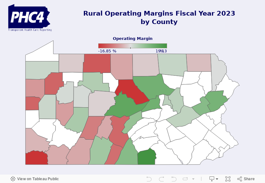
Below is a highlighted example of an interactive map built for a financial report focusing specifically on hospitals located in rural counties. This is the most visually complex map I have made for PHC4 and it sits on top of the report page to grab attention. Other PHC4 maps have typically been point maps for stand-alone projects.
MAPPED: Facility Ownership - Hospitals & Ambulatory Surgery Centers
Identifying the top-level owner for each hospital and ASC in Pennsylvania, is no small task and updating it isn’t either. Many researchers use datasets from Pitchbook and CMS and then do a lot of cleaning and individual ownership research to identify parent companies.
PHC4 is working with the facilities themselves to collect this information. Facilities submit ownership and a category of ownership to PHC4 each year as part of their contact update process and. I clean this data and verify any changes we may make to the submitted information with the facility. Compliance with collection of ownership information in this process has been high, but data quality has been variable. A couple common problems include: facilities insisting on a mid-level or subsidiary owner being named, facilities in the same system claiming different ownership, and highly complex ownership structures that are hard to capture in a clean dataset.
Nonetheless, as health care continues to consolidate, tracking this information is very valuable. Many researchers, legislators, and others are working on ways to improve transparency in ownership. PHC4 started providing this data for sale in 2025 and it was purchased several times by researchers seeking to supplement their discharge datasets with contextual ownership information.

View the full project at this link: https://www.phc4.org/reports-library/mapped-facility-ownership/
MAPPED: Access to Care - Hospitals, Ambulatory Surgery Centers, & Nursing Homes
What units, specialties, and services are available at each of Pennsylvania’s hospitals, ASCs, and nursing homes? This stand-alone project took data from the PA Department of Health’s facility reports. PHC4 data did not get used in this project. Instead, I pared down the information collected in these reports and published three maps with curated information. The theme of this project was access to care, so we chose to look at the available hospital units, the specialties at each ASC, and the services of nursing homes. I’ve embedded the hospital map below, it looks best on a computer. What I particularly like about this map and the row chart beneath it, is the ability to use the multi-select tool on the map to compare access to care for different services.

The rest of the project can be found at this link: https://www.phc4.org/reports-library/mapped-access-to-care/
Other projects
Expand the options below to see some of the other map-related projects I’ve worked on.
-
Cancer Surgery Volume Report 2025
This map provides users the ability to filter by cancer surgery type and view how many inpatient and outpatient surgical procedures were performed at that facility. Read the report here.
Hospital Performance Report 2024
This map was produced as a navigational tool for users visiting the page to quickly find data specific to a single hospital. This report was more than 3x as successful as the prior year due to increased media coverage and use of this interactive map. Read the report here.
Special Report on the Financial Health of Pennsylvania Rural Hospitals, Fiscal Year 2023
The map at the top of this page was produced for this report. Read the report here.
-
Current Events: Non-Competes in Health Care
In September of 2024, I published an article introducing a 3-year study that I am leading for PHC4 on non-compete agreements. The map embedded in that article summarizes health care non-compete legislation across the country. Read the article here.